
Creating spontaneous and memorable road trips
Seamlessly plan and experience your next road trip and discover those hidden spots you would have never found otherwise.
Overview
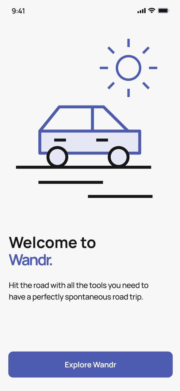
In UXDG310 class, we learned to design our first UX project with the prompt of creating a travel app. We created Wandr as our solution that reimagines the road trip experience/ Wandr allows users to find hidden gems along their routes and make planning a trip easy and fun with their friends. As it was our first project we shared a lot of responsibilities before we learned to delegate. I worked on research, ideation, flows/architecture, wireframes and prototyping. It was an eventful 10 weeks!
My Role
Project Manager and Usability Lead
Teammates
Chi Quach (UI designer) and Zach Hoedl (graphic designer)
Tools
Figma, Figjam, Illustrator, After Effects
THE PROBLEM
Lack of fun in-trip options while road trippin'
There are many available options for planning a trip and making but users expressed pain points of boring and montonuous road trips with friends.
Introducing Wandr
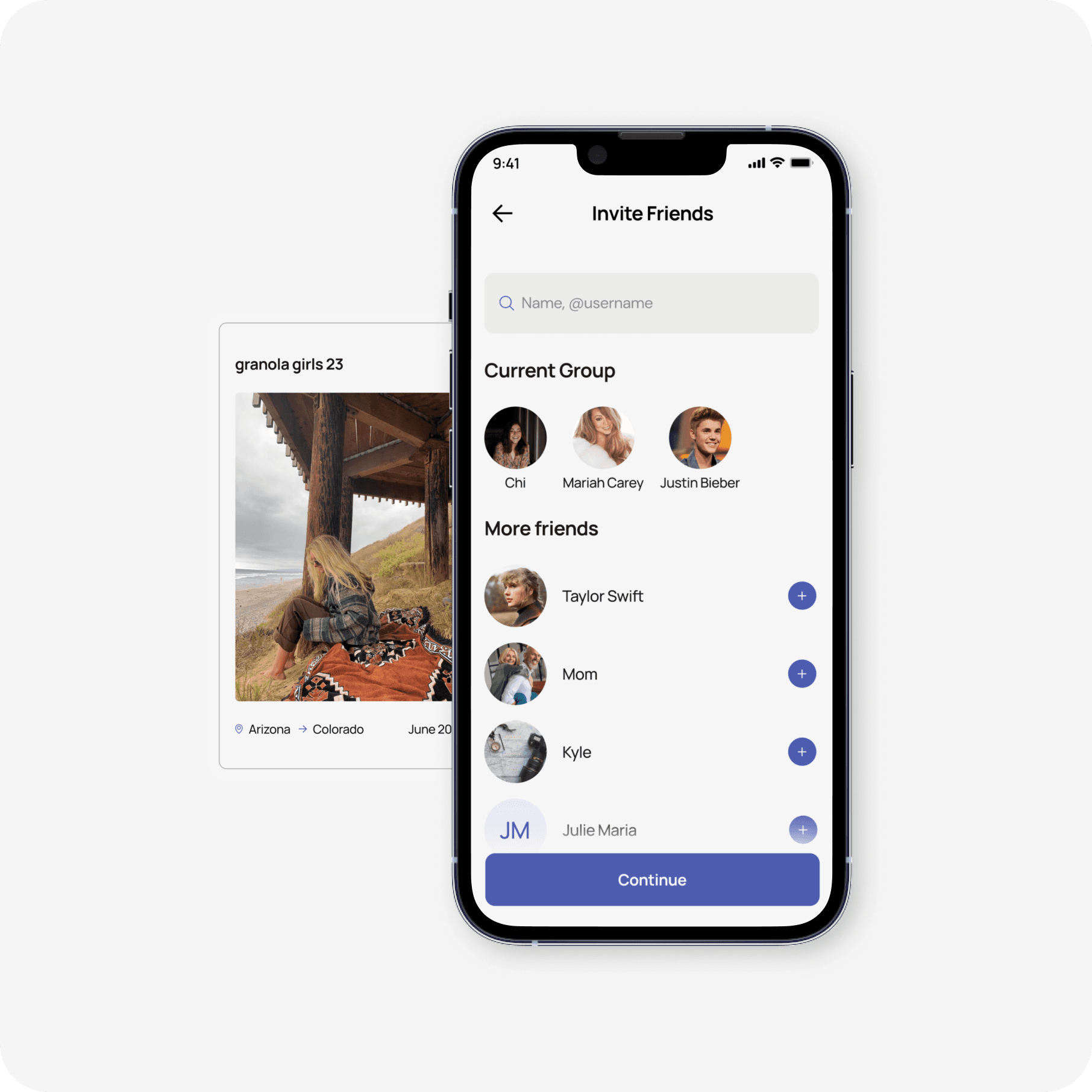
Invite friends and plan group trips in one place
No more complicated road trip planning when you can do it all in one place!
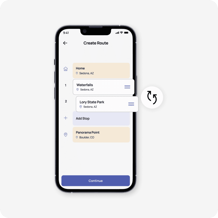
Create and edit your roadtrip routes
Overview all the chosen stops and easily change around routes and delete what doesn’t fit for you.
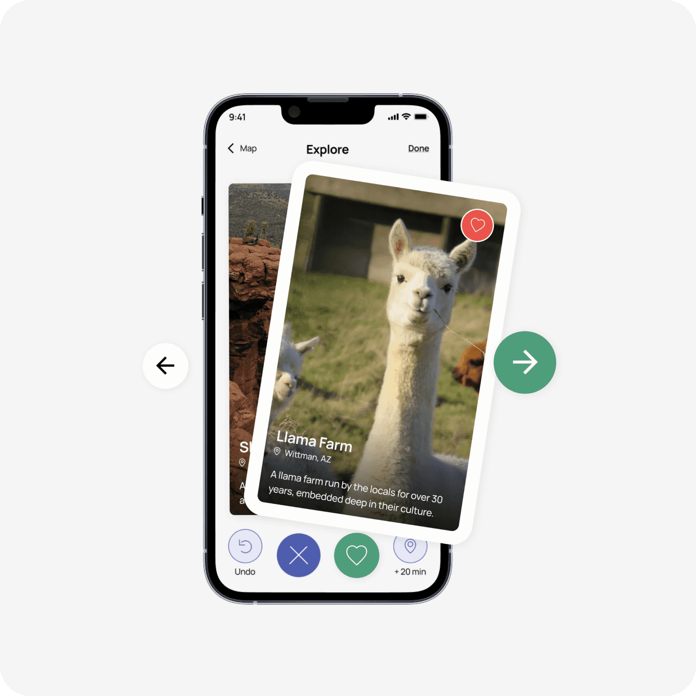
Spontaneously swipeand discover new places
Once trip information is put in, the group can swipe to vote on the places they want to go along the way.
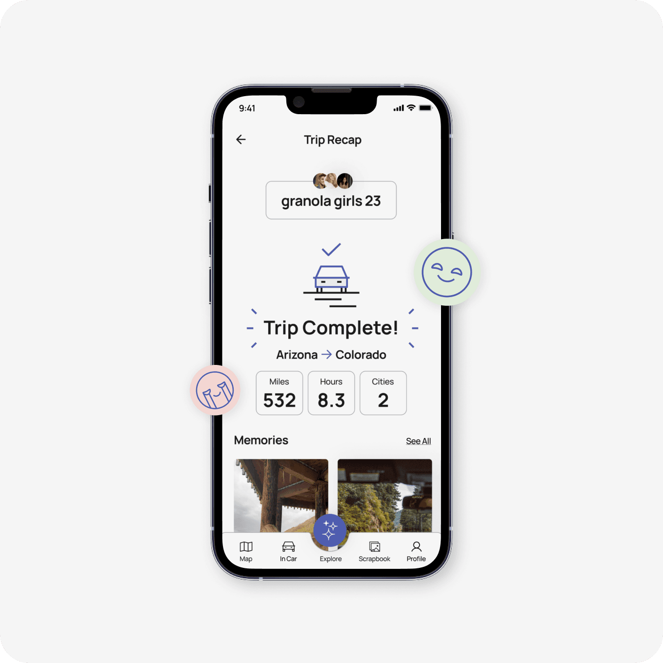
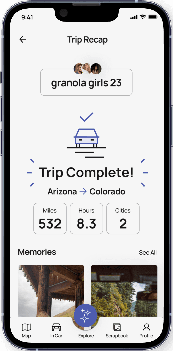
Celebrate and recap your roadtrip journey
Dive into the highlights of your journey, capturing every twist, turn, and memorable moment along the way.
Our Research Process
Our goal before starting research was to uncover the pain points users encounter during road trips and explore their favorite and least favorite aspects of their previous road trip travel experience. We did this in order to understand how we can “recreate” those positive experiences. Keeping this in mind, we conducted interviews with 6 travelling individuals.
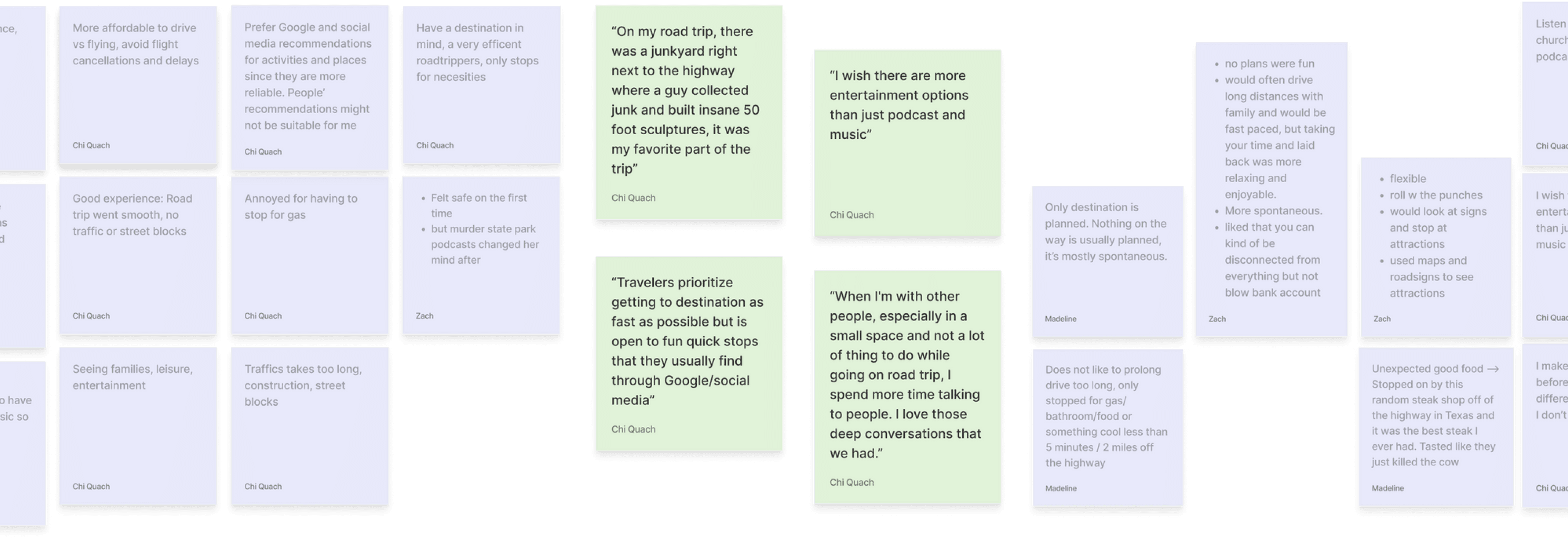
Key Insights
Spontaneity
When we asked our interviewees to recall their favorite road trip memories, almost all of them recalled a spontaneous experience that was unexpected.
Coordination
Planning a road trip with your friend group is fun, but trying to compromise everyone's preferences and schedules can be a real headache.
Boredom
Driving for hours on the same road, seeing the same views, and doing the same activities can get boring, especially with limited entertainment options.
KEY DECISION
Focus on the spontaneous and emotional aspect of road trips while considering practical planning aspects second.
Finding our opportunity
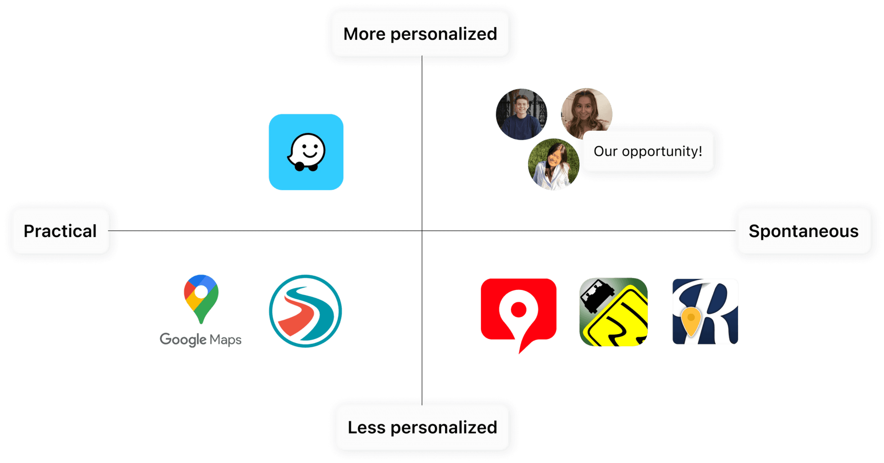
To affirm this key decision of focusing on the emotional aspect of road trips, we ran through a competitive analysis. We found that there are a lot of existing apps focus on navigation and the booking process sector. However, there are only few focusing on emotional and joyful aspect of traveling. Because of this, our vision is a more personalized and fun road trip experience.
Crafting our flow to solve user pain points
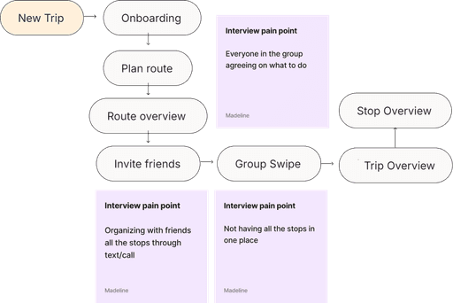
Every feature aims to solve the pain points we gathered from our interviews with users. You can see those pain points in the sticky notes in the flow. We broke up our flow in the key stages of the trip: planning, in-trip, and post-trip.


Stage 1:
Planning
Stage 2:
In-Trip
Stage 3:
Post-Trip
KEY LEARNING MOMENT
During testing, many people were confused about the flow. This is because we made a crucial mistake in crafting our flows. Instead of creating flows based on tasks, we made flows based on screens.
Lo-Fi to Hi-Fi
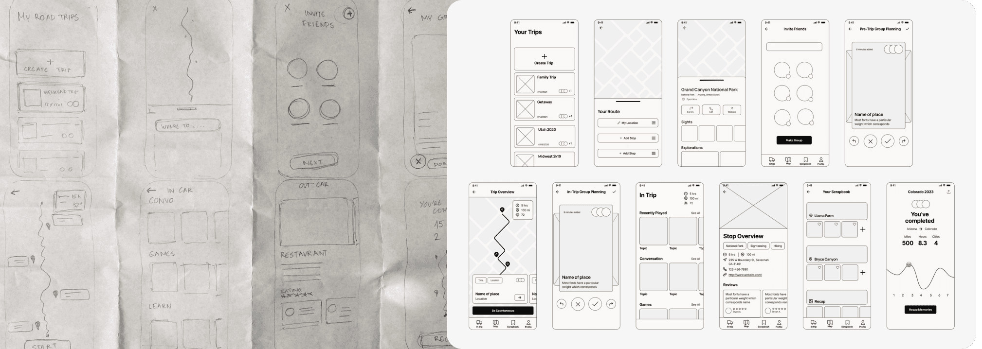
From our flows, we did the Crazy 8’s exercise to quickly sketch lo-fi wireframes on paper. We choose our favorites and made mid-fi wireframes to guide our final design.
KEY LEARNING MOMENT
We should’ve tested at the mid-fi stage, but we created hi-fis immediately after and wasted time.
Learn from best practices and principles
We regularly tested our design system to ensure it met accessibility standards.

WCAG AAA and AA color pallete
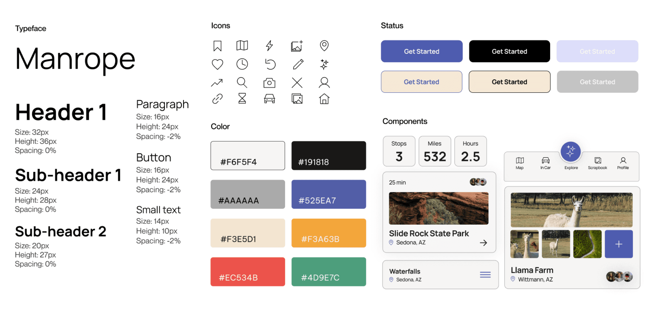
We chose light yellow, blue, and smoky white as our brand colors. We then selected color pairings that comply with WCAG AAA and AA standards.
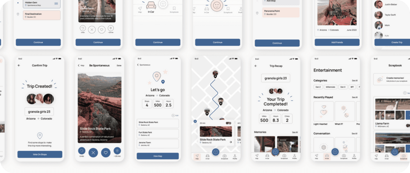
Color Blind Test
We tested our UI for Tritanopia since blue and yellow are our main accent colors. It was also tested without color to ensure the contrast for legibility.
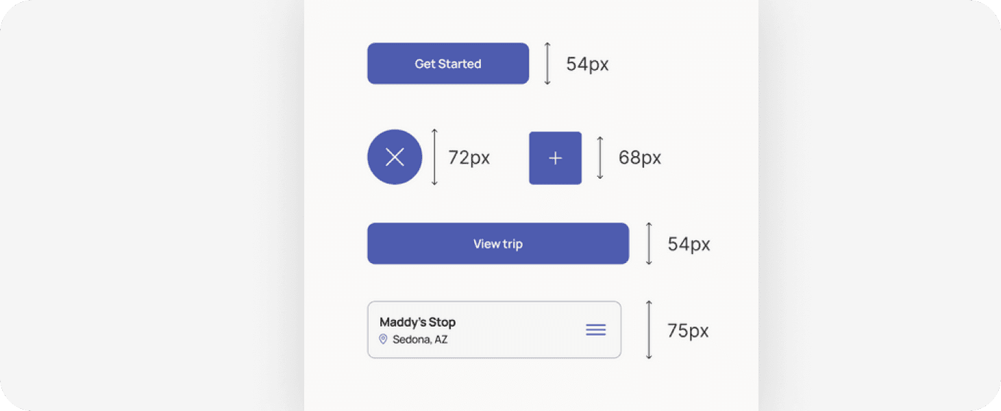
Touch target for buttons
All touch targets are sized appropriately for mobile. They are colored with the primary action blue.
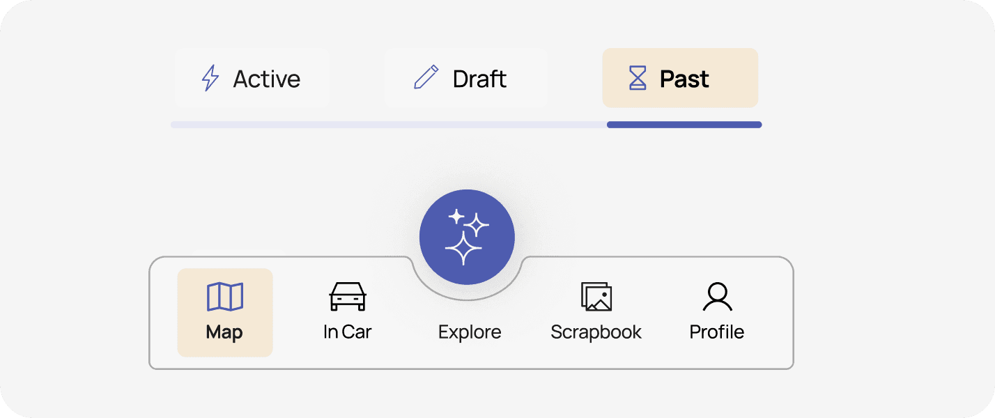
Labelled icons
We intentionally labelled all icons and tabs to create easy understanding. To show the ux principle of “visibility of system status” we made sure to highlight active tabs.
Moderated Usability Testing
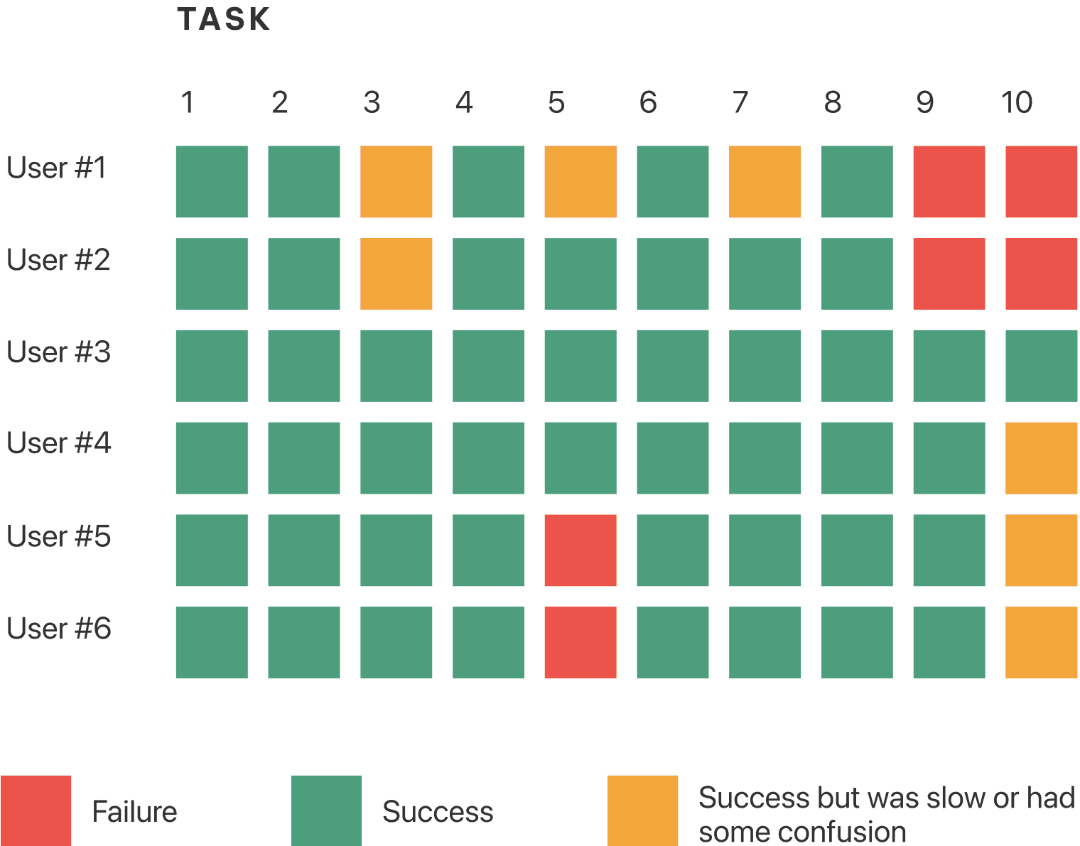
Our goal was to collect as much feedback as possible on the usability of our app and to validate our concept. Down below is our task completion chart we created, to understand which flows needed the most work. Link to our usability testing script here
KEY INSIGHT
We need a clearer onboarding process to give users a better understanding of our product and needed to work on the visual hierarchy of key pages.
Making iterations based on testing feedback
From our detailed notes taken during usability testing, we combed through every detail and made changes to our screens.
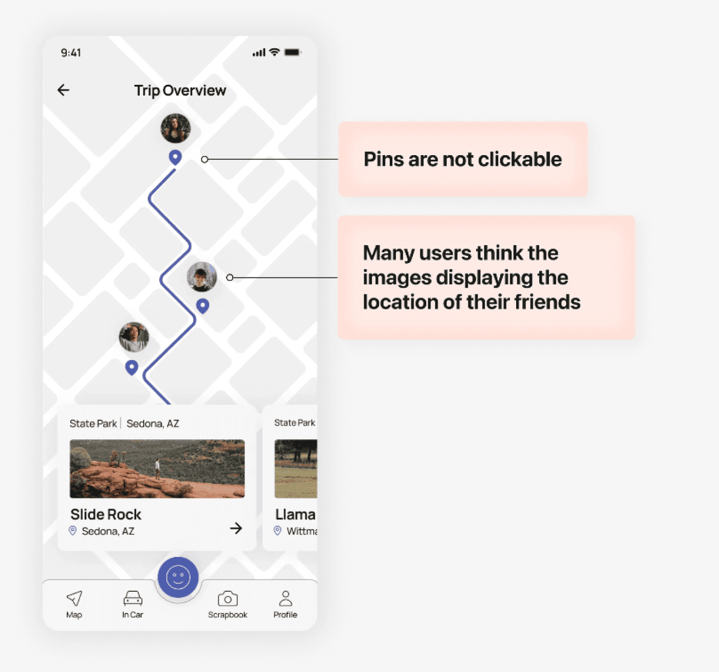
Before
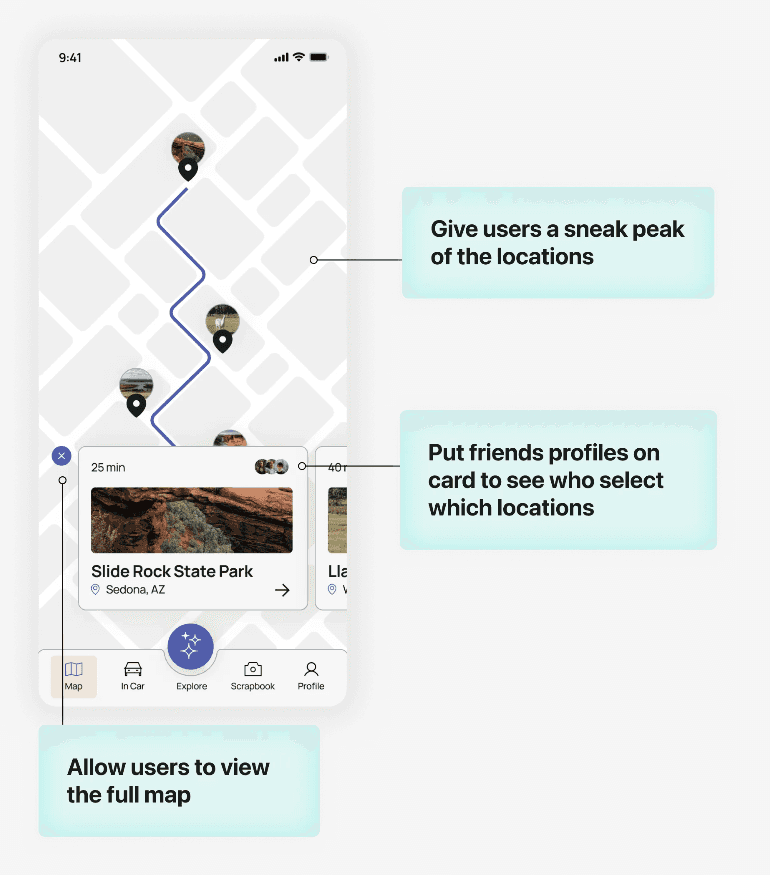
After
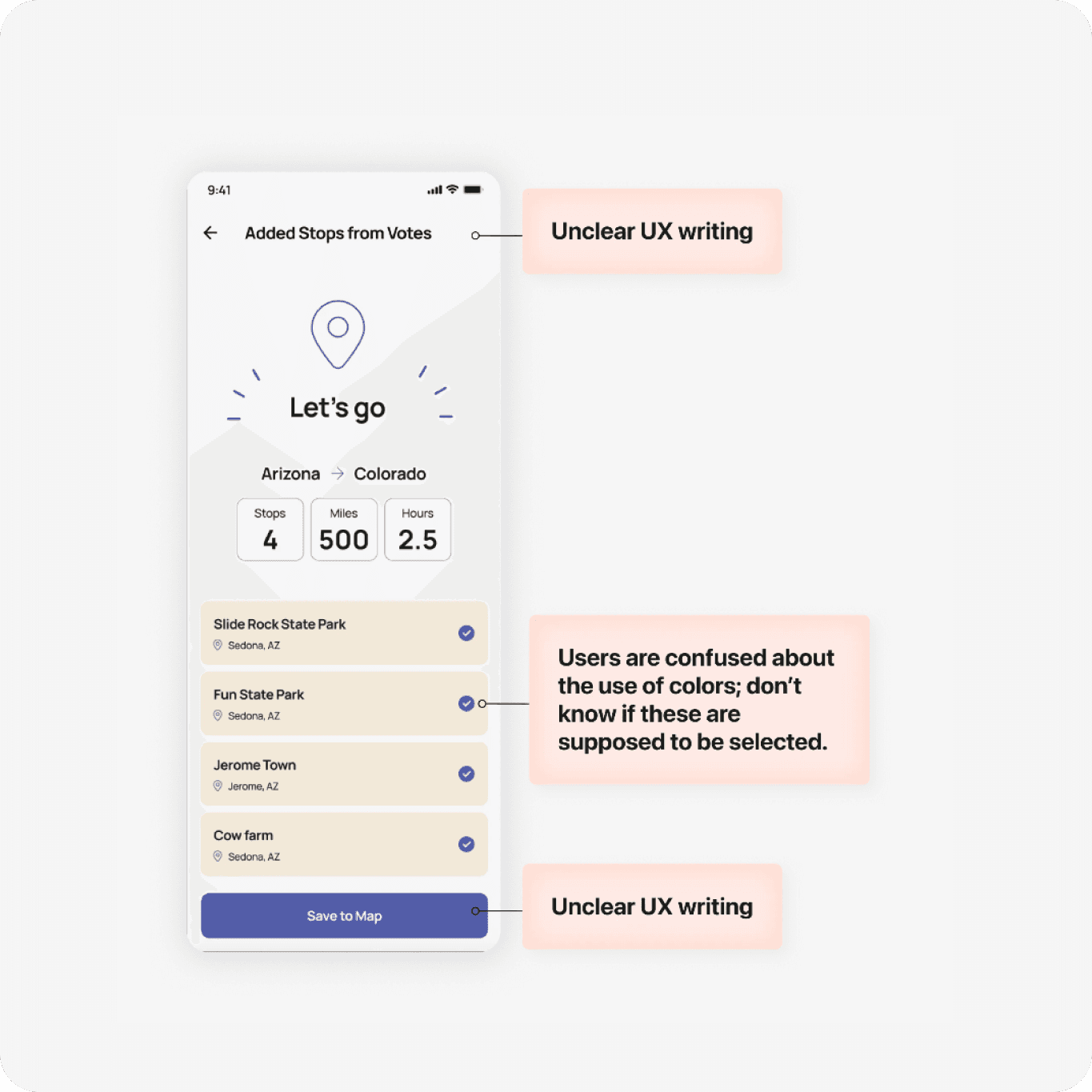
Before
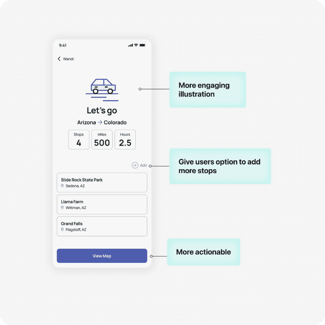
After
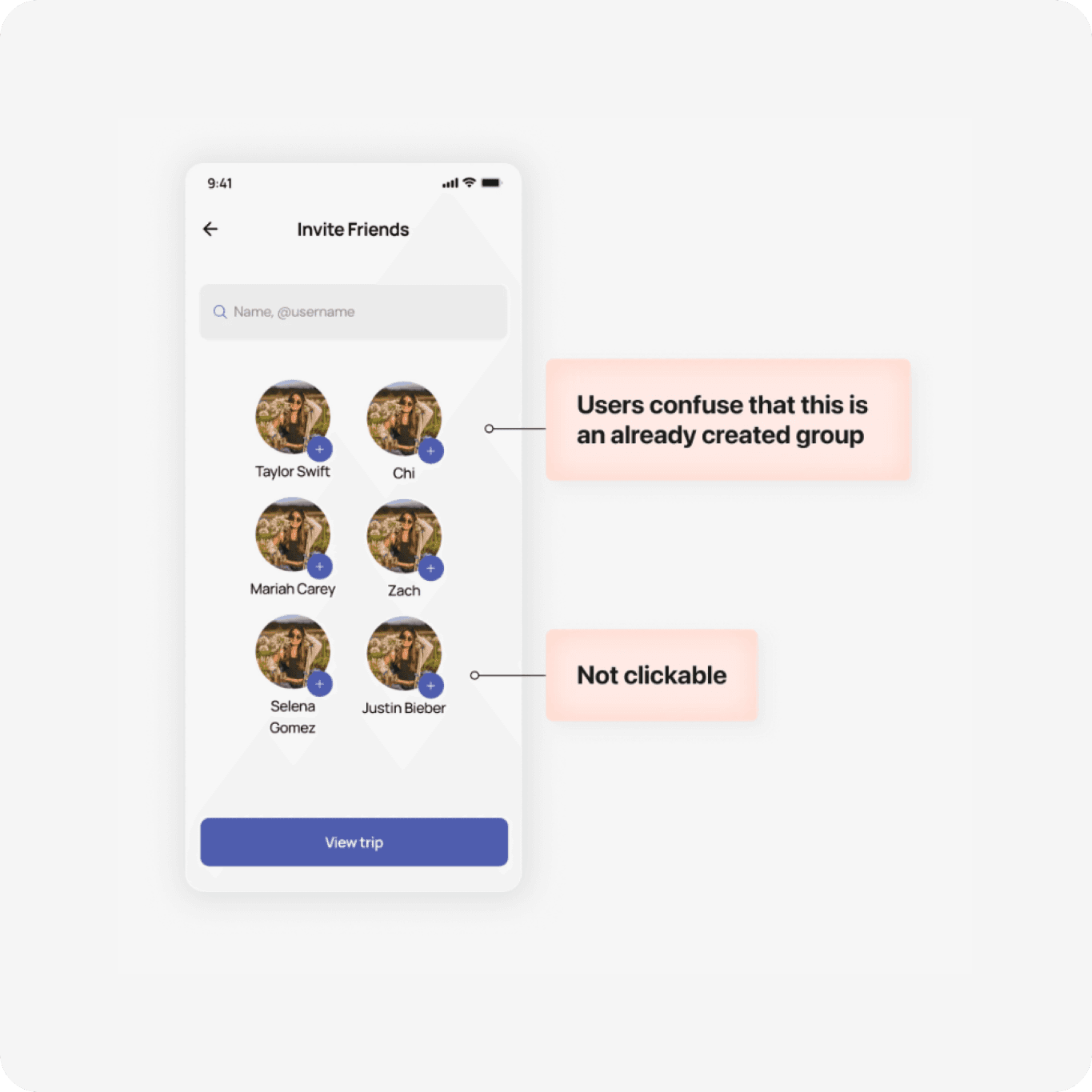
Before
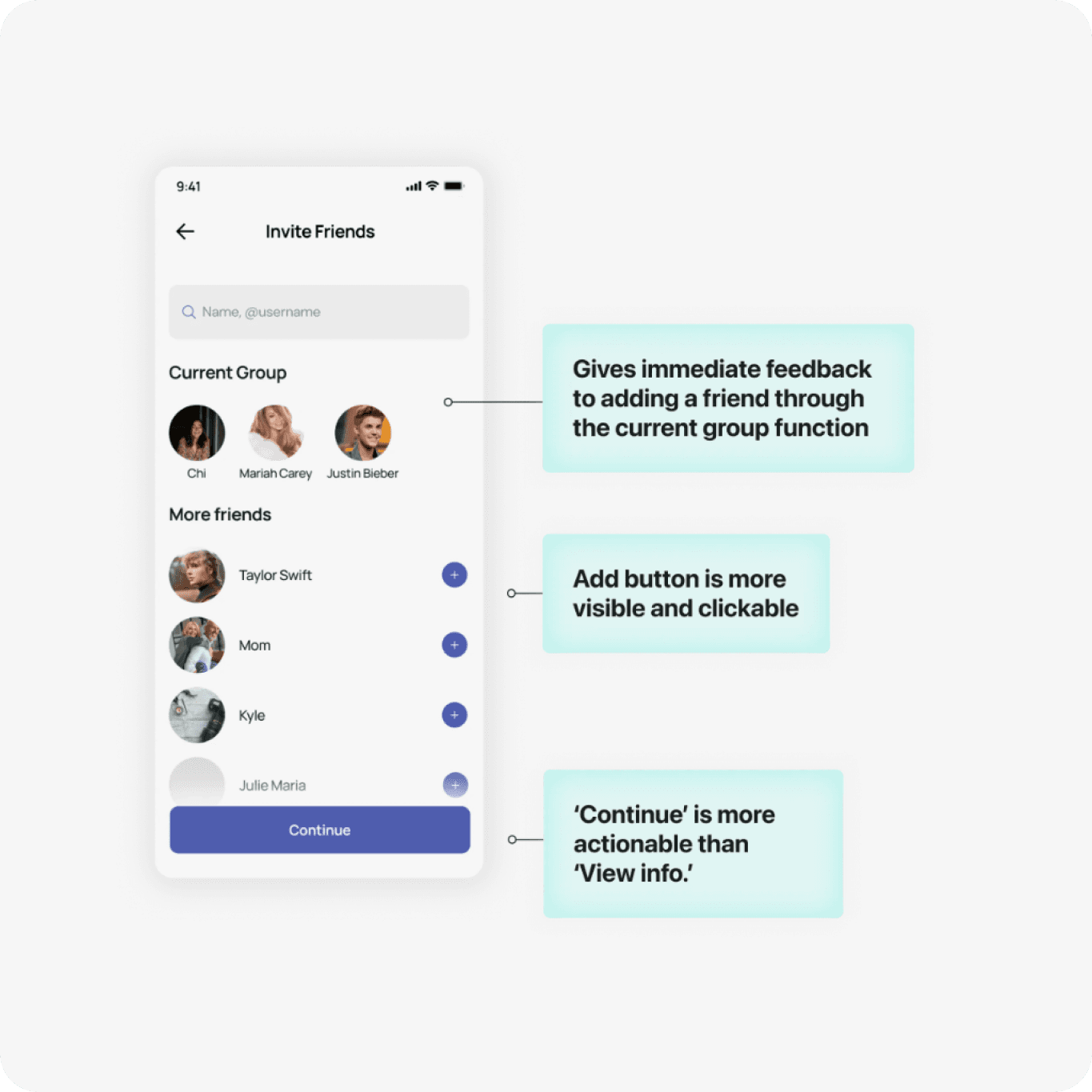
After
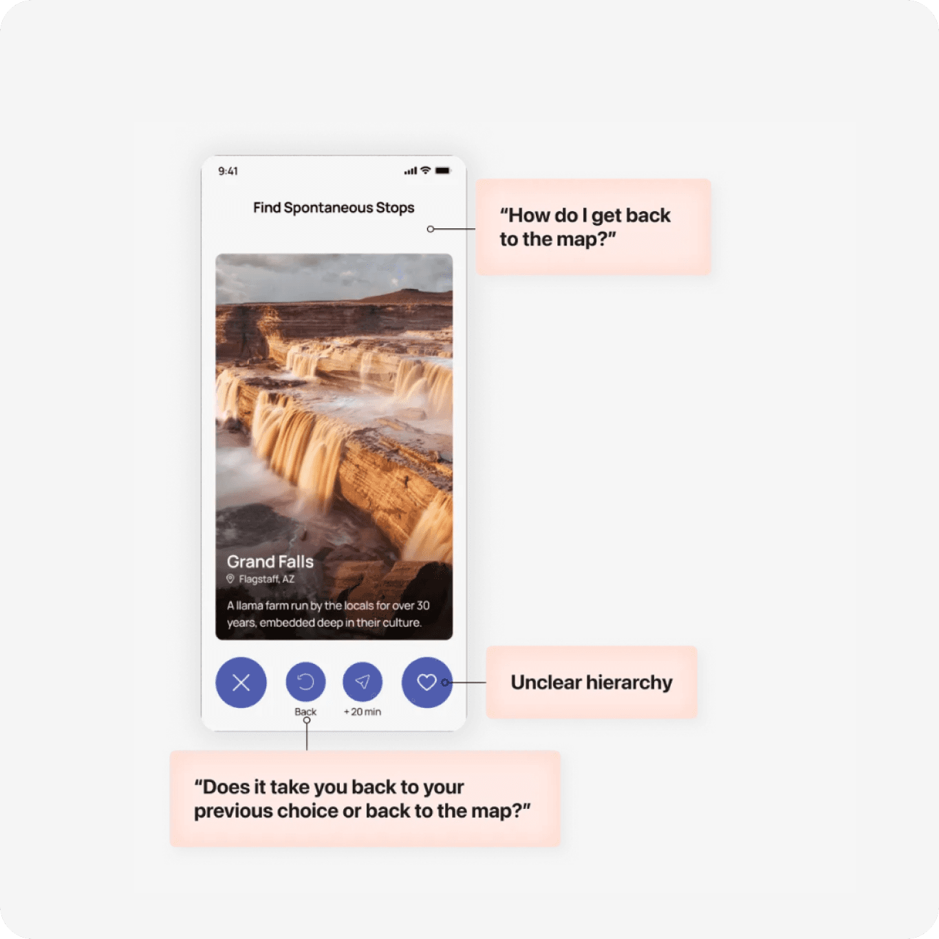
Before
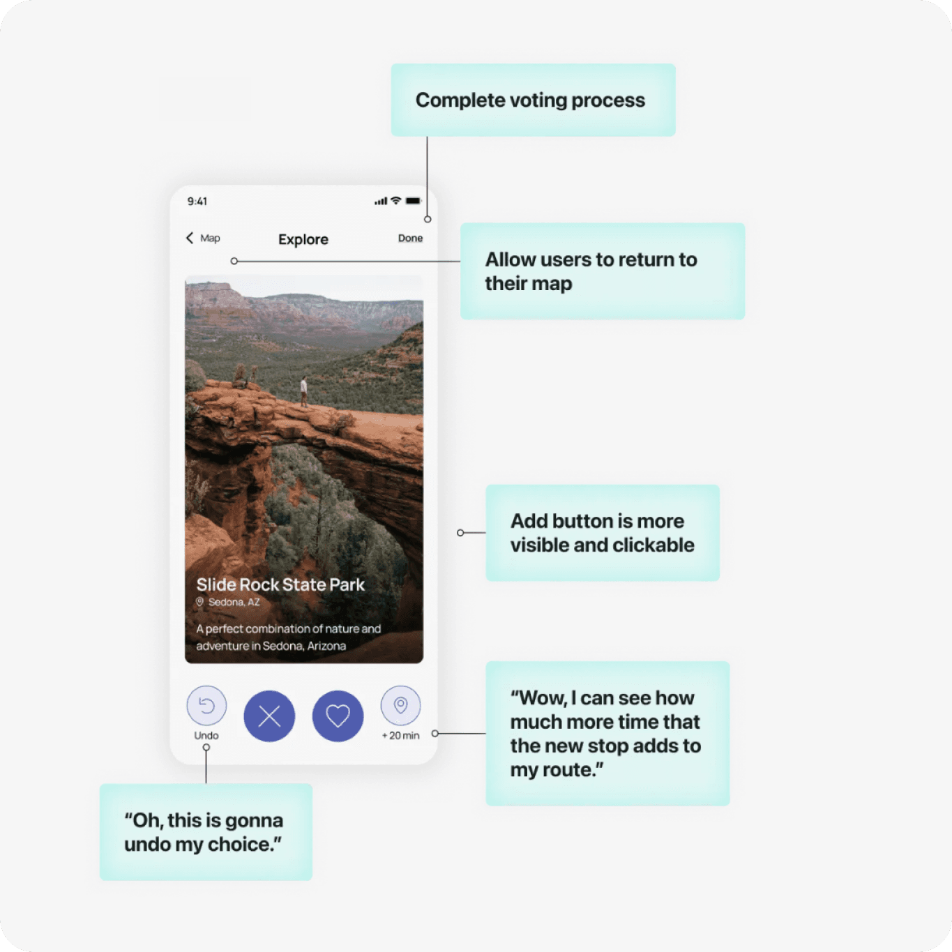
After
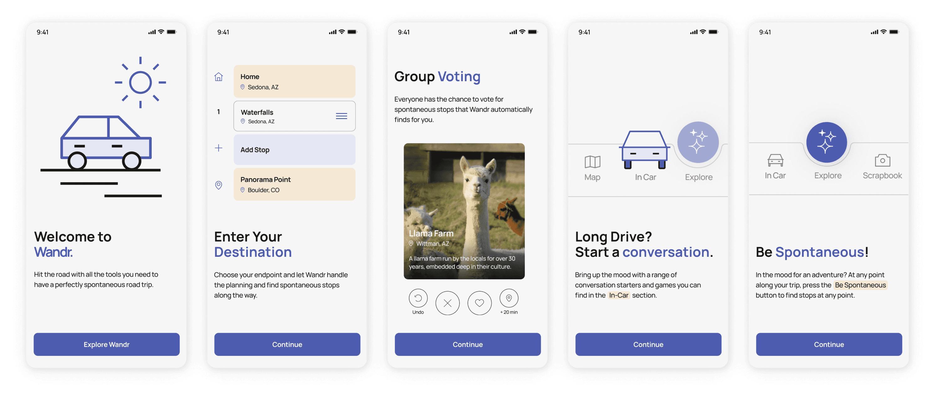
Adding the onboarding flow
One of the most underrated flows
Reflection
Focus in on one specific problem and audience.
If we focused on the needs and preferences of a specific user group and narrowed down the problem, it could have enabled us to create a more impactful and tailored solution that resonated more deeply with users. This approach would have streamlined the design process by eliminating unnecessary complexities and features which we struggled with while ideating.
Progress over perfection
As this was our first project and we were intimidated, we spent a lot of time nitpicking over small details that wasn’t as important to our end product. You can always adapt a design later on but you can’t get back wasted time!

Overview
In UXDG310 class, we learned to design our first UX project with the prompt of creating a travel app. We created Wandr as our solution that reimagines the road trip experience/ Wandr allows users to find hidden gems along their routes and make planning a trip easy and fun with their friends. As it was our first project we shared a lot of responsibilities before we learned to delegate. I worked on research, ideation, flows/architecture, wireframes and prototyping. It was an eventful 10 weeks!
My Role
Project Manager and Usability Lead
Teammates
Chi Quach (UI designer) and Zach Hoedl (graphic designer)
Tools
Figma, Figjam, Illustrator, After Effects
THE PROBLEM
Lack of fun in-trip options while road trippin'
There are many available options for planning a trip and making but users expressed pain points of boring and montonuous road trips with friends.
THE PROBLEM
Lack of fun in-trip options while road trippin'
There are many available options for planning a trip and making but users expressed pain points of boring and montonuous road trips with friends.
Introducing Wandr
Introducing Wandr

Invite friends and plan group trips in one place
No more complicated road trip planning when you can do it all in one place!

Invite friends and plan group trips in one place
No more complicated road trip planning when you can do it all in one place!

Create and edit your roadtrip routes
Overview all the chosen stops and easily change around routes and delete what doesn’t fit for you.

Create and edit your roadtrip routes
Overview all the chosen stops and easily change around routes and delete what doesn’t fit for you.

Spontaneously swipeand discover new places
Once trip information is put in, the group can swipe to vote on the places they want to go along the way.

Spontaneously swipeand discover new places
Once trip information is put in, the group can swipe to vote on the places they want to go along the way.

Celebrate and recap your roadtrip journey
Dive into the highlights of your journey, capturing every twist, turn, and memorable moment along the way.

Celebrate and recap your roadtrip journey
Dive into the highlights of your journey, capturing every twist, turn, and memorable moment along the way.
Our Research Process
Our goal before starting research was to uncover the pain points users encounter during road trips and explore their favorite and least favorite aspects of their previous road trip travel experience. We did this in order to understand how we can “recreate” those positive experiences. Keeping this in mind, we conducted interviews with 6 travelling individuals.


Key Insights
Spontaneity
When we asked our interviewees to recall their favorite road trip memories, almost all of them recalled a spontaneous experience that was unexpected.
Coordination
Planning a road trip with your friend group is fun, but trying to compromise everyone's preferences and schedules can be a real headache.
Boredom
Driving for hours on the same road, seeing the same views, and doing the same activities can get boring, especially with limited entertainment options.
KEY DECISION
Focus on the spontaneous and emotional aspect of road trips while considering practical planning aspects second.
KEY DECISION
Focus on the spontaneous and emotional aspect of road trips while considering practical planning aspects second.
Finding our opportunity
To affirm this key decision of focusing on the emotional aspect of road trips, we ran through a competitive analysis. We found that there are a lot of existing apps focus on navigation and the booking process sector. However, there are only few focusing on emotional and joyful aspect of traveling. Because of this, our vision is a more personalized and fun road trip experience.


Crafting our flow to solve user pain points
Every feature aims to solve the pain points we gathered from our interviews with users. You can see those pain points in the sticky notes in the flow. We broke up our flow in the key stages of the trip: planning, in-trip, and post-trip.
Crafting our flow to solve user pain points
Every feature aims to solve the pain points we gathered from our interviews with users. You can see those pain points in the sticky notes in the flow. We broke up our flow in the key stages of the trip: planning, in-trip, and post-trip.


Stage 1:
Planning
Stage 2:
In-Trip
Stage 3:
Post-Trip


Stage 1:
Planning
Stage 2:
In-Trip
Stage 3:
Post-Trip
KEY LEARNING MOMENT
During testing, many people were confused about the flow. This is because we made a crucial mistake in crafting our flows. Instead of creating flows based on tasks, we made flows based on screens.
KEY LEARNING MOMENT
During testing, many people were confused about the flow. This is because we made a crucial mistake in crafting our flows. Instead of creating flows based on tasks, we made flows based on screens.
Lo-Fi to Hi-Fi
From our flows, we did the Crazy 8’s exercise to quickly sketch lo-fi wireframes on paper. We choose our favorites and made mid-fi wireframes to guide our final design.
Lo-Fi to Hi-Fi
From our flows, we did the Crazy 8’s exercise to quickly sketch lo-fi wireframes on paper. We choose our favorites and made mid-fi wireframes to guide our final design.


KEY LEARNING MOMENT
We should’ve tested at the mid-fi stage, but we created hi-fis immediately after and wasted time.
KEY LEARNING MOMENT
We should’ve tested at the mid-fi stage, but we created hi-fis immediately after and wasted time.
Learn from best practices and principles
We regularly tested our design system to ensure it met accessibility standards.
Learn from best practices and principles
We regularly tested our design system to ensure it met accessibility standards.


WCAG AAA and AA color pallete
We chose light yellow, blue, and smoky white as our brand colors. We then selected color pairings that comply with WCAG AAA and AA standards.

WCAG AAA and AA color pallete
We chose light yellow, blue, and smoky white as our brand colors. We then selected color pairings that comply with WCAG AAA and AA standards.

Color Blind Test
We tested our UI for Tritanopia since blue and yellow are our main accent colors. It was also tested without color to ensure the contrast for legibility.

Color Blind Test
We tested our UI for Tritanopia since blue and yellow are our main accent colors. It was also tested without color to ensure the contrast for legibility.

Touch target for buttons
All touch targets are sized appropriately for mobile. They are colored with the primary action blue.

Touch target for buttons
All touch targets are sized appropriately for mobile. They are colored with the primary action blue.

Labelled icons
We intentionally labelled all icons and tabs to create easy understanding. To show the ux principle of “visibility of system status” we made sure to highlight active tabs.

Labelled icons
We intentionally labelled all icons and tabs to create easy understanding. To show the ux principle of “visibility of system status” we made sure to highlight active tabs.
Moderated Usability Testing
Our goal was to collect as much feedback as possible on the usability of our app and to validate our concept. Down below is our task completion chart we created, to understand which flows needed the most work. Link to our usability testing script here
Moderated Usability Testing
Our goal was to collect as much feedback as possible on the usability of our app and to validate our concept. Down below is our task completion chart we created, to understand which flows needed the most work. Link to our usability testing script here


KEY INSIGHT
We need a clearer onboarding process to give users a better understanding of our product and needed to work on the visual hierarchy of key pages.
KEY INSIGHT
We need a clearer onboarding process to give users a better understanding of our product and needed to work on the visual hierarchy of key pages.
Making iterations based on testing feedback
From our detailed notes taken during usability testing, we combed through every detail and made changes to our screens.
Making iterations based on testing feedback
From our detailed notes taken during usability testing, we combed through every detail and made changes to our screens.

Before

After

Before

After

Before

After

Before

After

Before

After

Before

After

Before

After

Before

After
Adding the onboarding flow
One of the most underrated flows
Adding the onboarding flow
One of the most underrated flows


Reflection
Focus in on one specific problem and audience.
If we focused on the needs and preferences of a specific user group and narrowed down the problem, it could have enabled us to create a more impactful and tailored solution that resonated more deeply with users. This approach would have streamlined the design process by eliminating unnecessary complexities and features which we struggled with while ideating.
Progress over perfection
As this was our first project and we were intimidated, we spent a lot of time nitpicking over small details that wasn’t as important to our end product. You can always adapt a design later on but you can’t get back wasted time!