Overview
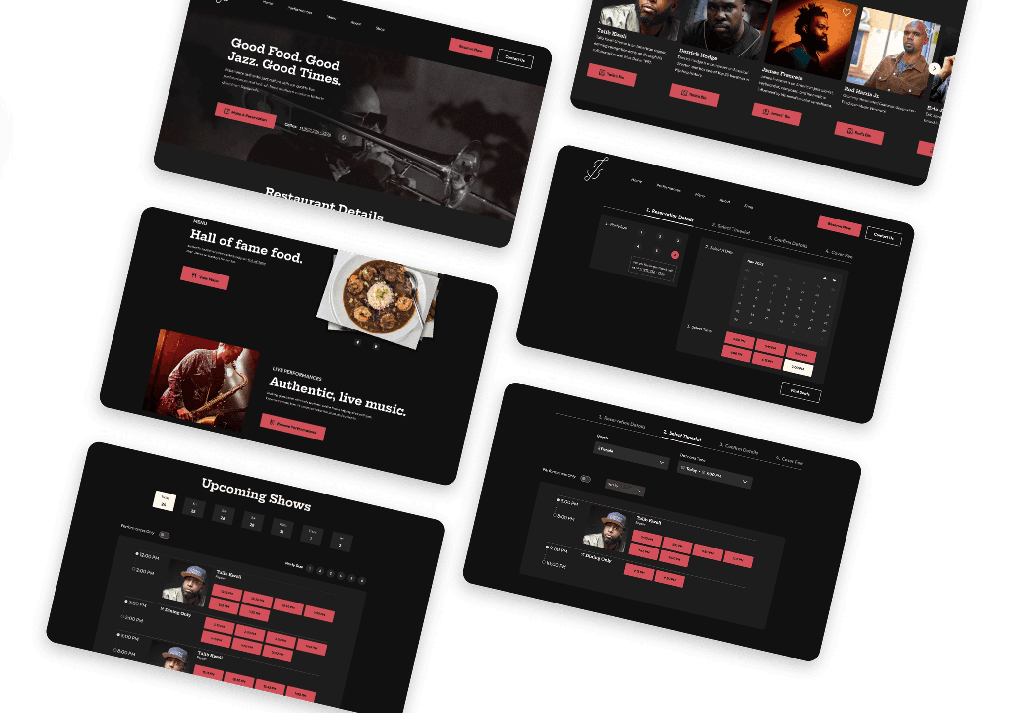
Good Times is a restaurant and jazz bar. To match their in-house experience, Good Time’s website needed a revamp. This project was a product of my Information Architecture class with the intention to redesign and rebrand a local business within Savannah, GA. We were close collaborators on this project. We worked on research, wireframes, design, testing, refining all together. Our timeline was our class semester: 10 weeks, Mar-May 2023.
My Role
UX designer and strategist
Teammates
Madeline Bay, Andrew Botkin, Zach Hoedl
Tools
Figma, Figjam, Illustrator
Our Research Process
Our goal before starting research was to uncover the pain points users encounter during road trips and explore their favorite and least favorite aspects of their previous road trip travel experience. We did this in order to understand how we can “recreate” those positive experiences. Keeping this in mind, we conducted interviews with 6 travelling individuals.
THE PROBLEM
Unflective and outdated, a bad user experience
Good Times Jazz and Restaurant, a local restaurant in Savannah had a website that needed some help.
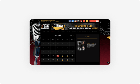
Fragmented Reservation Process
The website lacked a comprehensive reservation process that made it confusing for patrons and performers alike. Reservations were outsourced to third-party services like OpenTable.
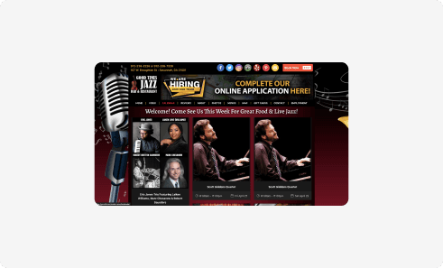
Overwhelming UI
The UI was confusing and overwhelming for users to navigate. The information architecture was disorganized and the site was not WCAG AAA compliant.
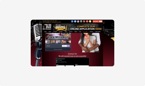
Outdated Branding
The website branding felt dated and dull compared to their exciting in-person experience.
Building the foundation with research
Before redesigning the Good Times Jazz website, our team conducted extensive research to build a solid foundation moving forward. This research would be used to guide our design process.
STEP 1
Defining our target audience
Customers: Gen X to Boomer
From our research, we found that Jazz clubs often attract an audience that primarily consists of Gen-X and older.
Jazz Artists
Because we want to attract more top quality performers, which in turn attracts more customers, we wanted to appeal to potential musicians.
STEP 2
Card Sorting for Info Prioritization
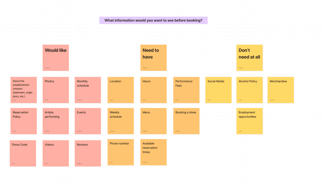
We utilized card sorting to understand customers mental models of Good Times content and the reservation process. We then asked our participants to group based on importance (need to have, would like, and don’t need at all). This was done with 5 participants.
STEP 3
Comparing info arch to competitors
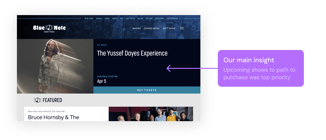
In addition to card sorting and site mapping, we conducted a thorough competitive analysis. We looked at both local and global competitors to see what features and info were being prioritized
STEP 4
Customer Journey Mapping...where can we improve?
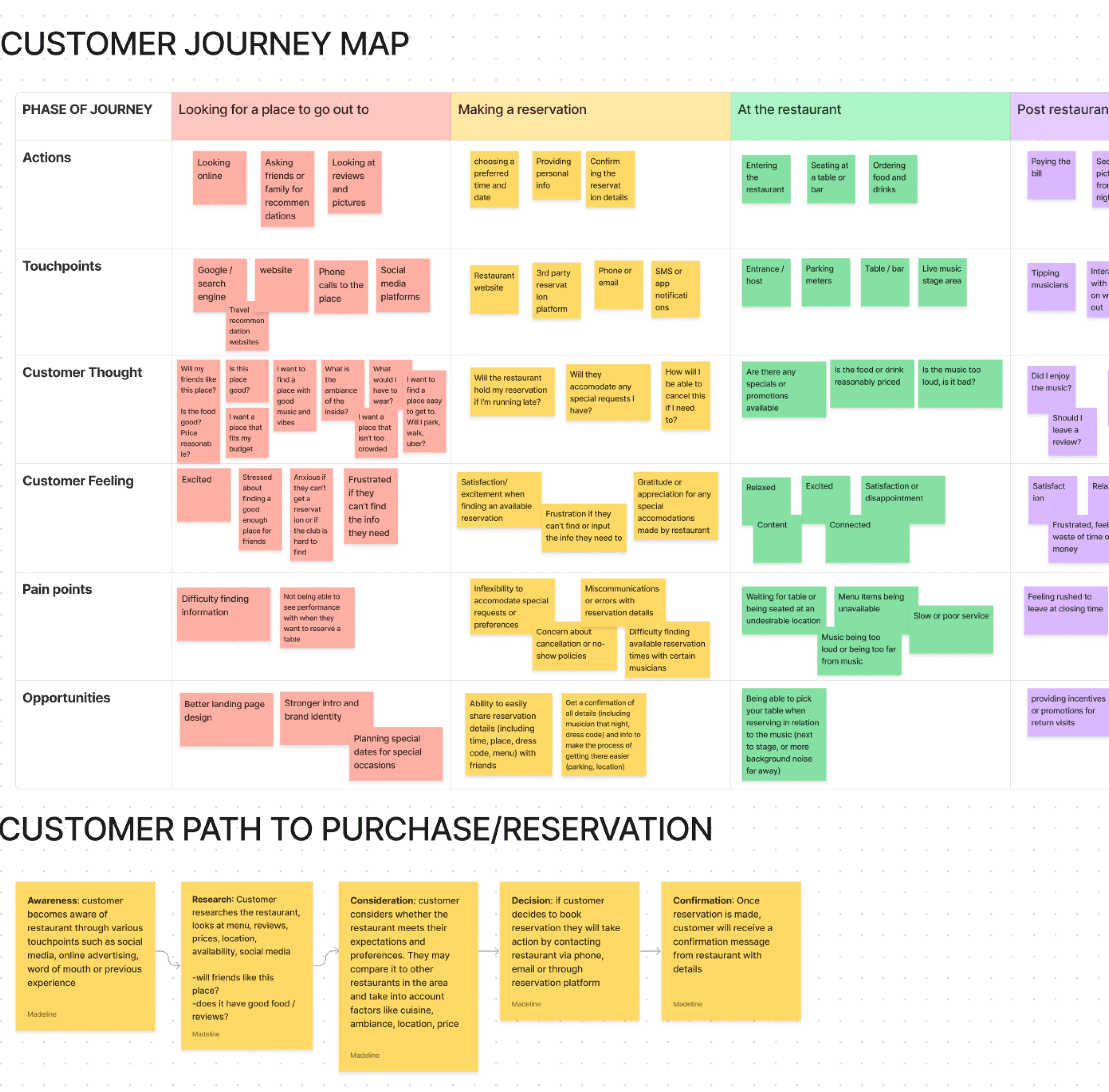
We mapped the path the reservation this helped us create a better flow for our homepage experience and address pain points during the reservation and booking experience.
STEP 5
Interviews...what makes them book?
With adults, 1 jazz enthusiast, and 1 musician. Our goal was to understand what information is most important to them. What makes customers book and what do musicians look for in venues?

Key Insights
The musician page is the main product and selling point.
We realized their main product is the music, not the menu. That is why we started to put all our energy on the performances section of homepage and the artist bio page.
Viewing showtimes to booking a table has to be optimized.
Many people had difficulty remembering show times and booking reservation all in one place. So we decided from this to prioritize the path from looking at a musician and their showtimes to booking a table.
STEP 6
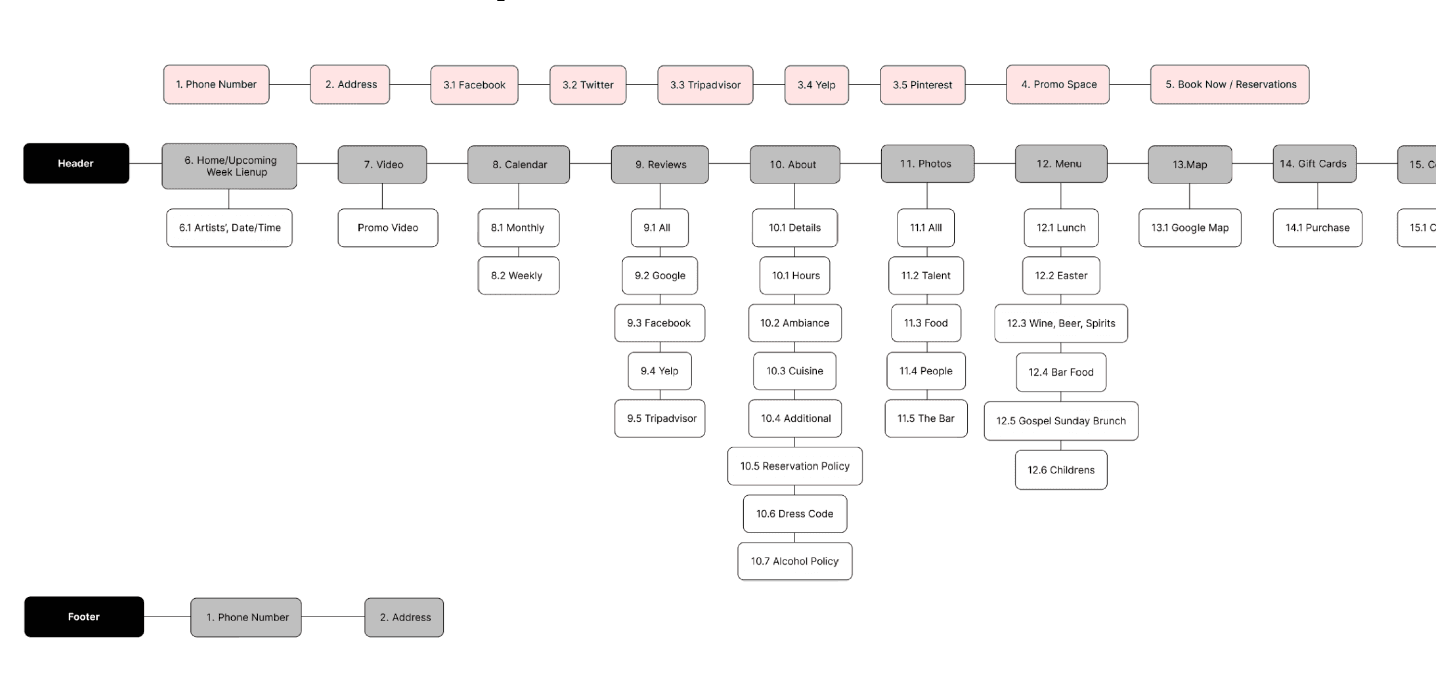
Using insights from step 1-5 to build a new sitemap
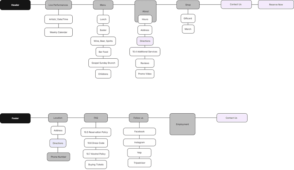
We grouped similar content and made higher ranked features more accessible and followed the 3 click-rule.
Before
After
After
Lo-Fi Wireframes
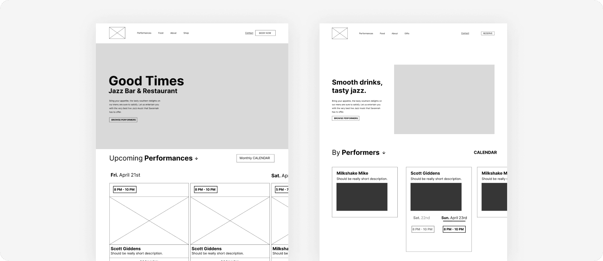
We started our design phase by producing rough sketches of our UI. Using those sketches, we designed multiple iterations of low-fidelity wireframes in figma. We did this for the homepage, the artist bio page and reservation page.
Mid-Fi Wireframes
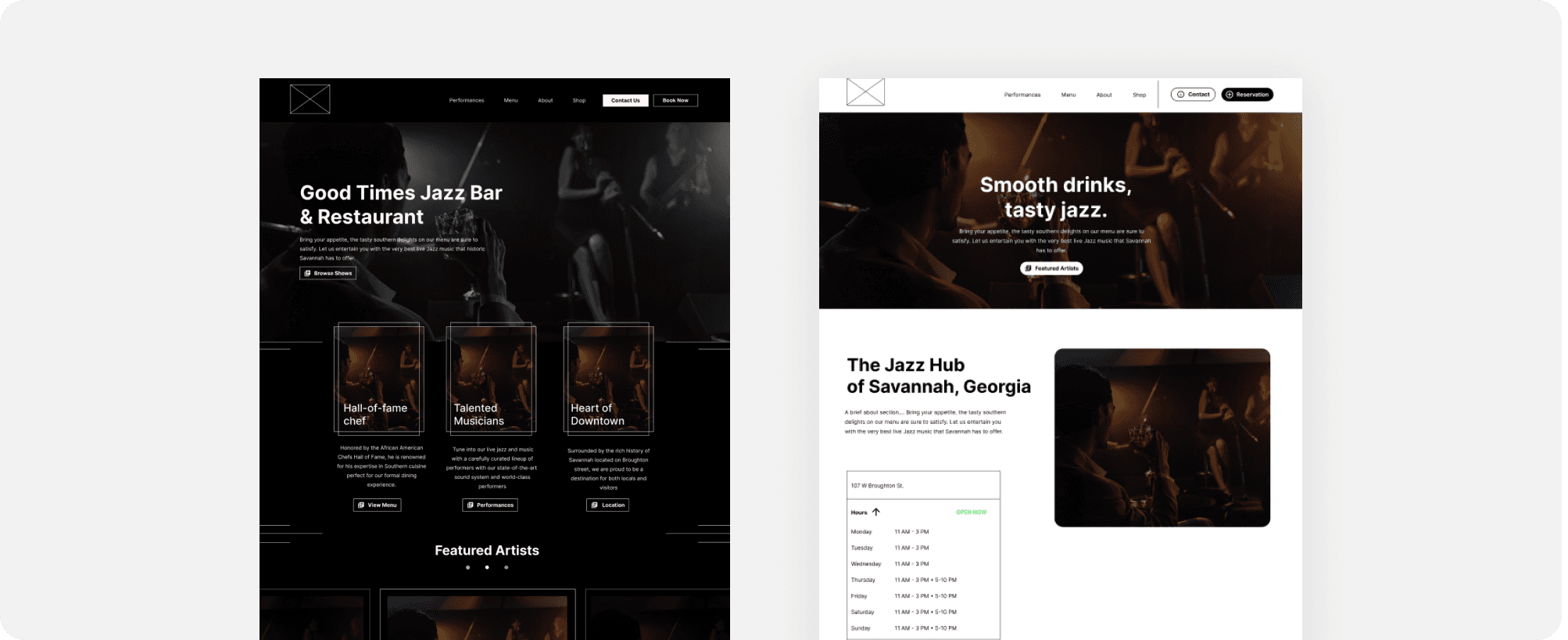
After presenting our low-fidelity wireframes we gained valuable insights and a clearer direction for the UI. We then began developing our mid-fidelity wireframes which would later be used for A/B testing and a graffiti board activity.
User Testing
We started our design phase by producing rough sketches of our UI. Using those sketches, we designed multiple iterations of low-fidelity wireframes in figma. We did this for the homepage, the artist bio page and reservation page.
A/B Testing
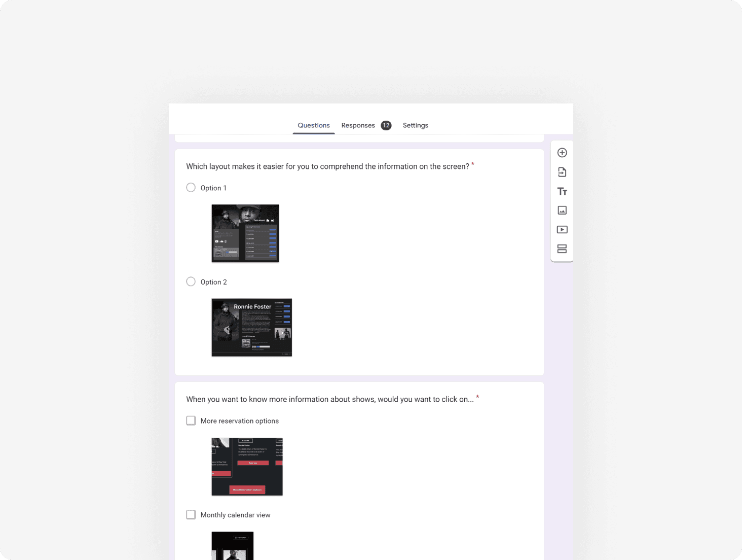
We launched a survey to get as many responses as possible to allow users to select preferred layouts, design elements, and features. Our goal was to consolidate down to the best candidates for final deliverables
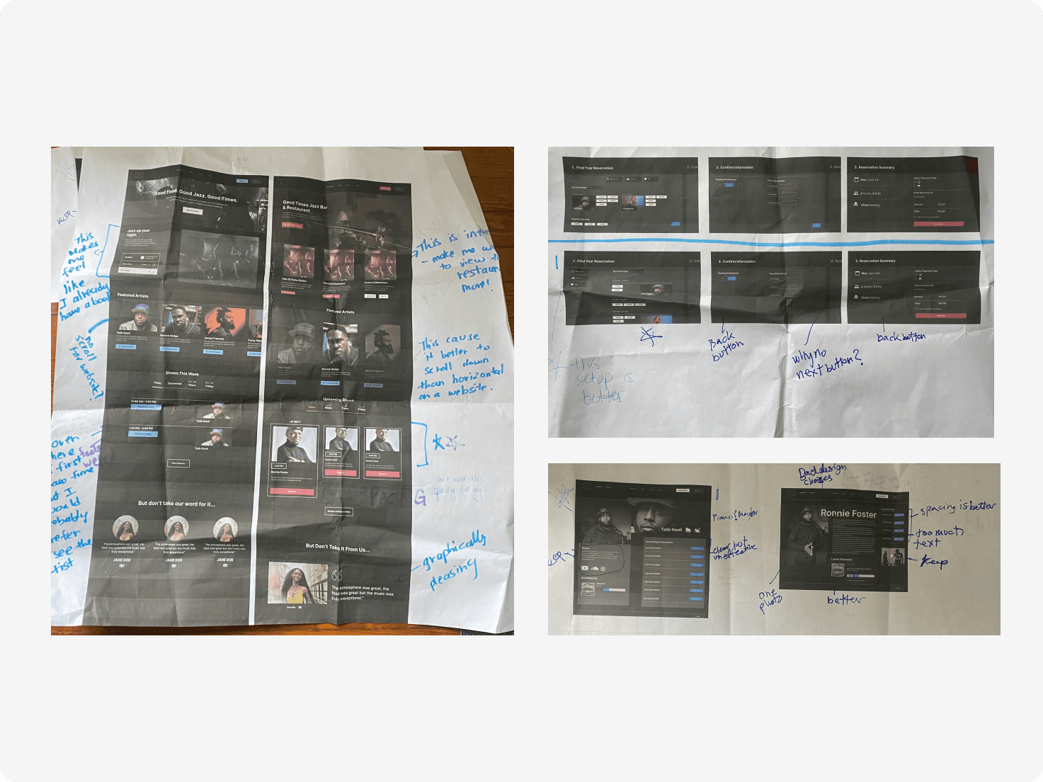
Graffiti Board
We posted posters around the school to get opinions on A/B experiences as well. Our goal was to find specific elements that needed improvement and understand user preferences.
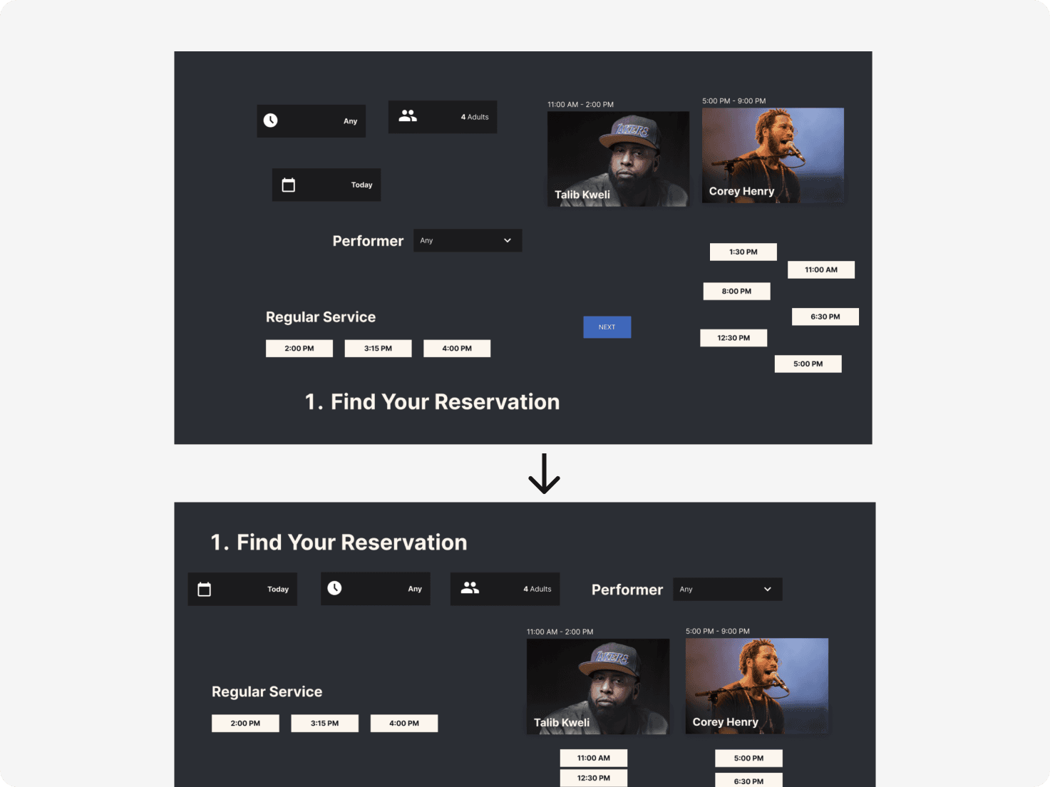
Re-ordering activity
On a google slide we cut out our UI and had users re-order to do what makes the most sense for them. This allowed us to create the most intuitive reservation experience possible.
Design System
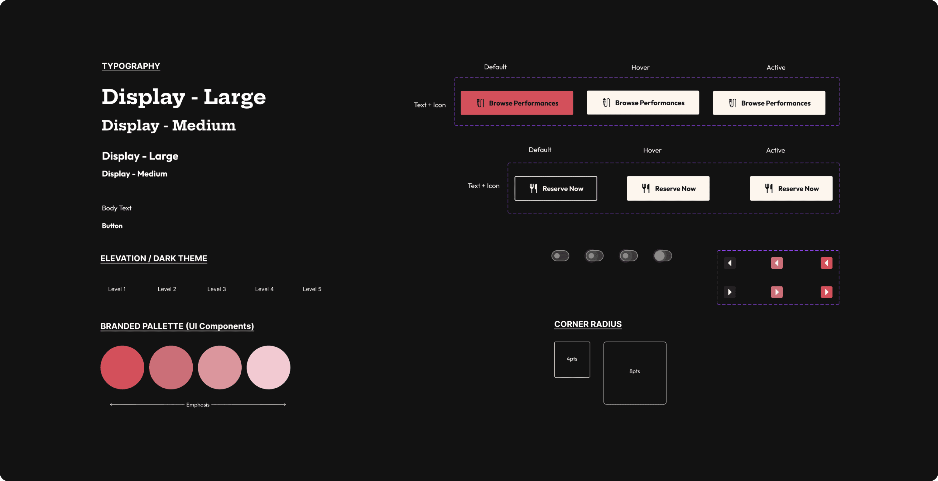
Creating our design system allowed us to have a standardized look across all of our wireframes. Additionally, it gave us the opportunity to focus on accessibility for our older audience. All components adhered to the WCAG AAA accessibility guidelines.
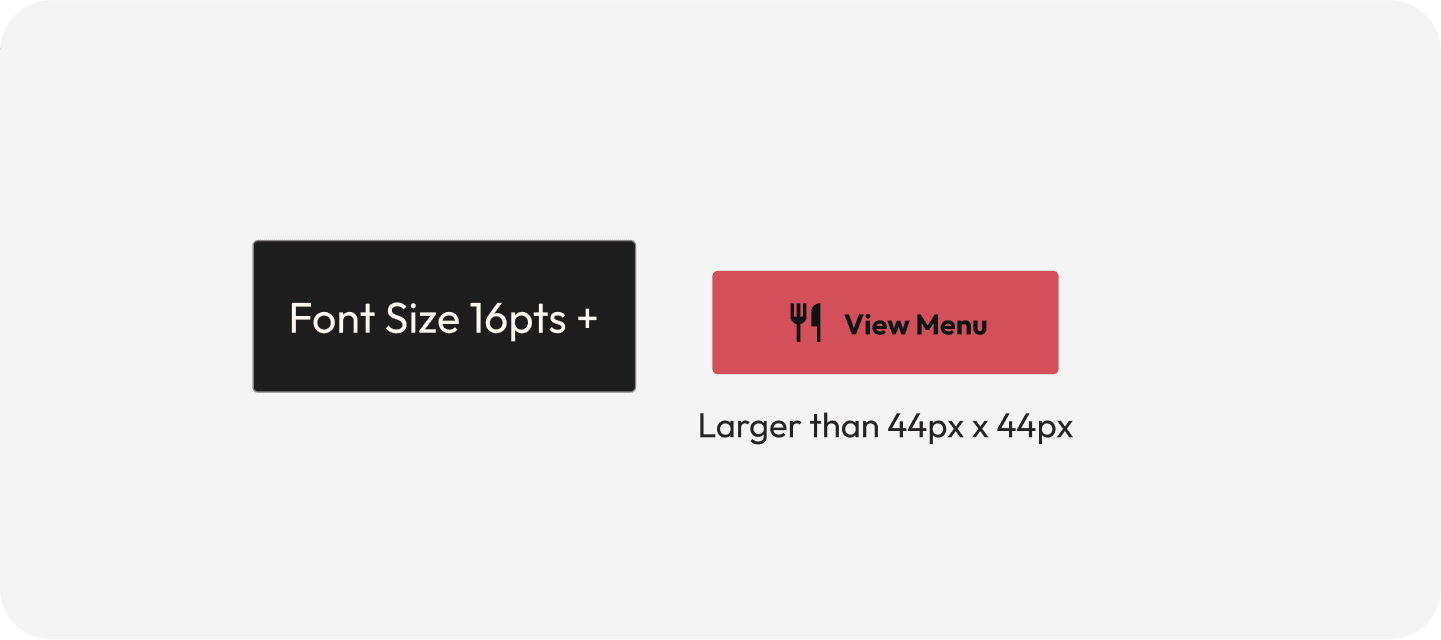
Touch Target for Buttons
Big enough so every tap and click is reached.
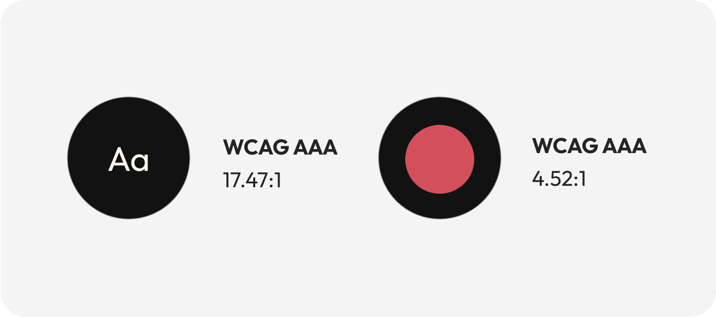
WCAG AAA and AA color pallete
We selected color pairings that comply with WCAG AAA and AA standards.
The result: A user-friendly website catering to diverse audiences, empowering jazz enthusiasts and artists alike.
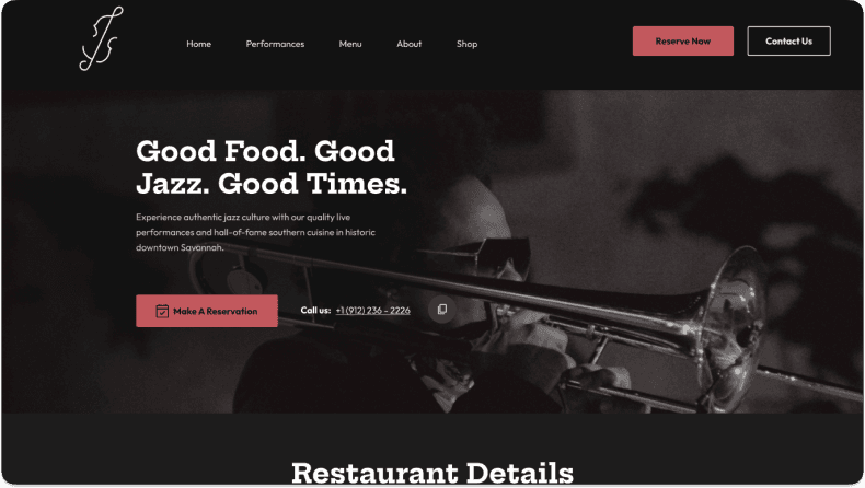
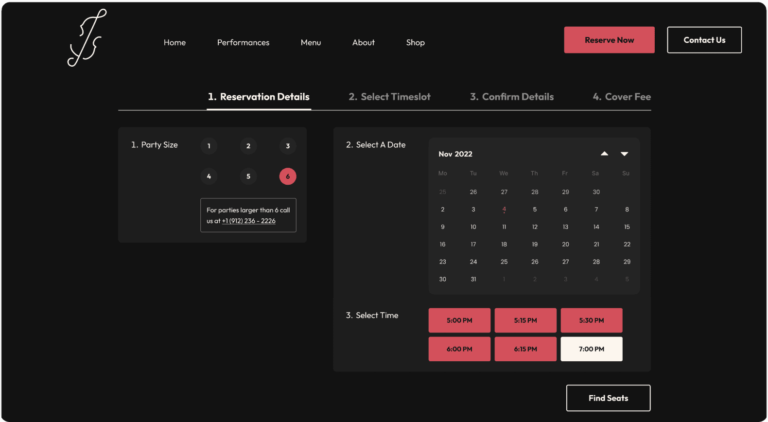
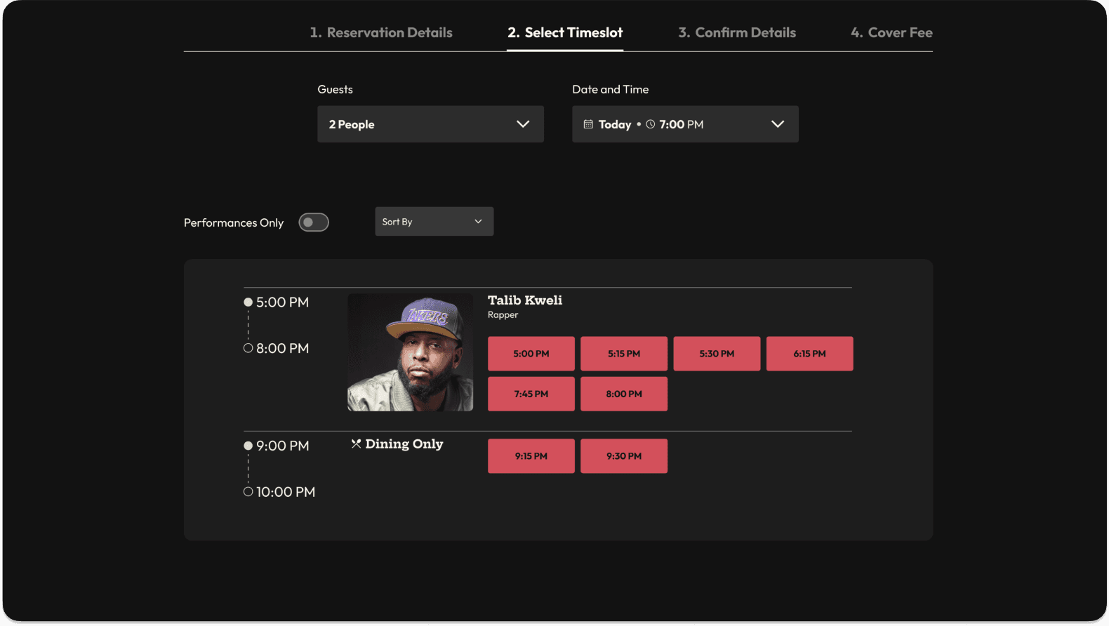
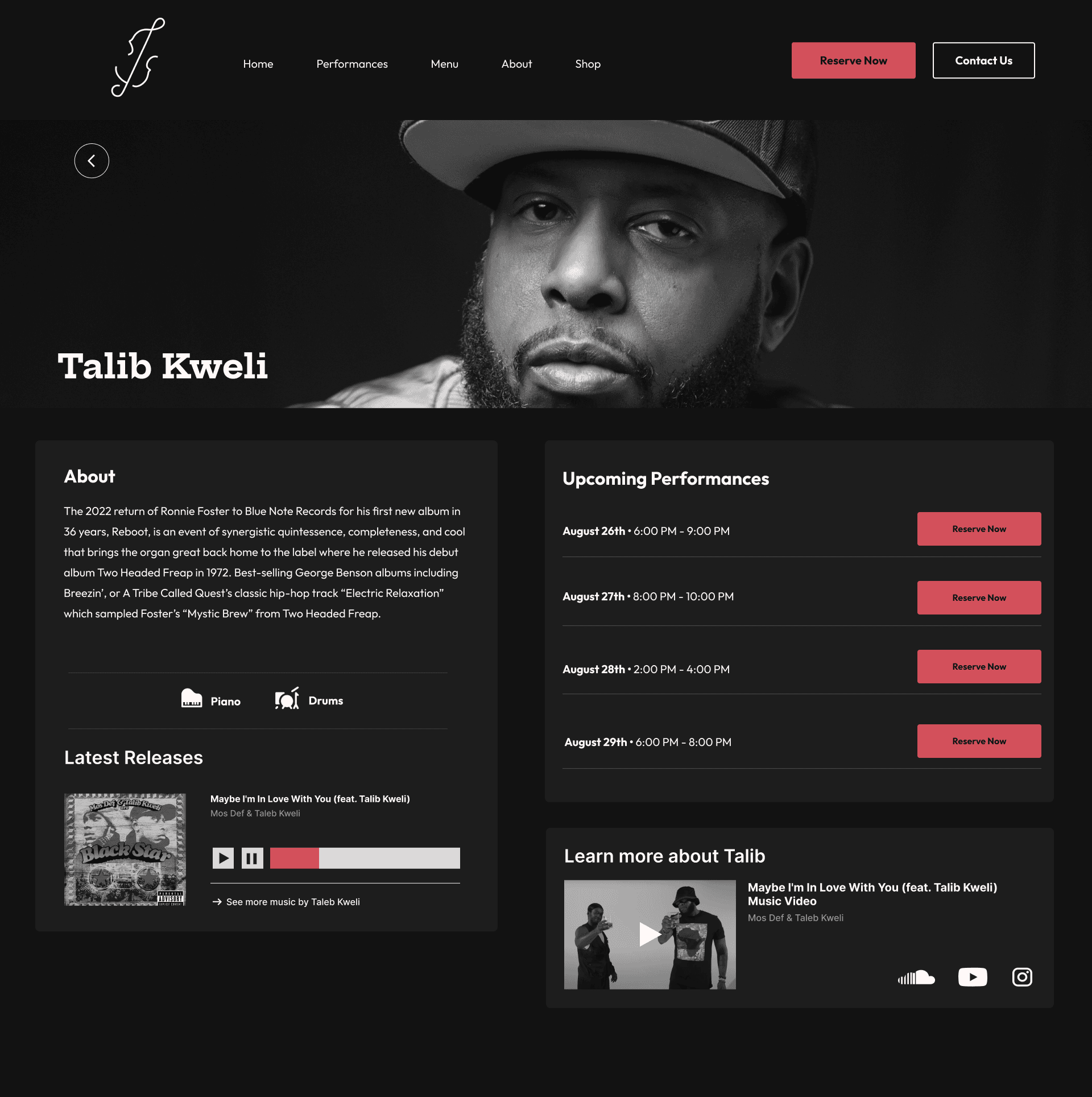
Take a look below at our key pages. The homepage, the reservation flow, and the artist bio page. These were the most important pages and flows to appeal to customer and therefore increase reservations.
Reflection
It was a success! Our project won 2 gold international design awards!
Our final product was loved by our class and we got 2 awards in Conceptual Products and Event Product Design.
What I would do differently next time - file organization and creating flows
We often to try come up with the most creative outrageous ideas, when in reality we should be prioritizing the keys flows and pain points we determined from our research. Secondly, from what I learned since being at a design agency, I cringe looking at our old file, I think file organization could’ve made collaborating a lot easier and streamlined.


Overview
Good Times is a restaurant and jazz bar. To match their in-house experience, Good Time’s website needed a revamp. This project was a product of my Information Architecture class with the intention to redesign and rebrand a local business within Savannah, GA. We were close collaborators on this project. We worked on research, wireframes, design, testing, refining all together. Our timeline was our class semester: 10 weeks, Mar-May 2023.
My Role
UX designer and strategist
Teammates
Madeline Bay, Andrew Botkin, Zach Hoedl
Tools
Figma, Figjam, Illustrator
Our Research Process
Our goal before starting research was to uncover the pain points users encounter during road trips and explore their favorite and least favorite aspects of their previous road trip travel experience. We did this in order to understand how we can “recreate” those positive experiences. Keeping this in mind, we conducted interviews with 6 travelling individuals.
THE PROBLEM
Unflective and outdated, a bad user experience
Good Times Jazz and Restaurant, a local restaurant in Savannah had a website that needed some help.
THE PROBLEM
Unflective and outdated, a bad user experience
Good Times Jazz and Restaurant, a local restaurant in Savannah had a website that needed some help.

Fragmented Reservation Process
The website lacked a comprehensive reservation process that made it confusing for patrons and performers alike. Reservations were outsourced to third-party services like OpenTable.

Fragmented Reservation Process
The website lacked a comprehensive reservation process that made it confusing for patrons and performers alike. Reservations were outsourced to third-party services like OpenTable.

Overwhelming UI
The UI was confusing and overwhelming for users to navigate. The information architecture was disorganized and the site was not WCAG AAA compliant.

Overwhelming UI
The UI was confusing and overwhelming for users to navigate. The information architecture was disorganized and the site was not WCAG AAA compliant.

Outdated Branding
The website branding felt dated and dull compared to their exciting in-person experience.

Outdated Branding
The website branding felt dated and dull compared to their exciting in-person experience.
Building the foundation with research
Before redesigning the Good Times Jazz website, our team conducted extensive research to build a solid foundation moving forward. This research would be used to guide our design process.
Building the foundation with research
Before redesigning the Good Times Jazz website, our team conducted extensive research to build a solid foundation moving forward. This research would be used to guide our design process.
STEP 1
Defining our target audience
Customers: Gen X to Boomer
From our research, we found that Jazz clubs often attract an audience that primarily consists of Gen-X and older.
Jazz Artists
Because we want to attract more top quality performers, which in turn attracts more customers, we wanted to appeal to potential musicians.
STEP 2
Card Sorting for Info Prioritization
We utilized card sorting to understand customers mental models of Good Times content and the reservation process. We then asked our participants to group based on importance (need to have, would like, and don’t need at all). This was done with 5 participants.


STEP 3
Comparing info arch to competitors
In addition to card sorting and site mapping, we conducted a thorough competitive analysis. We looked at both local and global competitors to see what features and info were being prioritized
STEP 3
Comparing info arch to competitors
In addition to card sorting and site mapping, we conducted a thorough competitive analysis. We looked at both local and global competitors to see what features and info were being prioritized


STEP 4
Customer Journey Mapping...where can we improve?
We mapped the path the reservation this helped us create a better flow for our homepage experience and address pain points during the reservation and booking experience.
STEP 4
Customer Journey Mapping...where can we improve?
We mapped the path the reservation this helped us create a better flow for our homepage experience and address pain points during the reservation and booking experience.


STEP 5
Interviews...what makes them book?
With adults, 1 jazz enthusiast, and 1 musician. Our goal was to understand what information is most important to them. What makes customers book and what do musicians look for in venues?
STEP 5
Interviews...what makes them book?
With adults, 1 jazz enthusiast, and 1 musician. Our goal was to understand what information is most important to them. What makes customers book and what do musicians look for in venues?


Key Insights
The musician page is the main product and selling point.
We realized their main product is the music, not the menu. That is why we started to put all our energy on the performances section of homepage and the artist bio page.
Viewing showtimes to booking a table has to be optimized.
Many people had difficulty remembering show times and booking reservation all in one place. So we decided from this to prioritize the path from looking at a musician and their showtimes to booking a table.
STEP 6
Using insights from step 1-5 to build a new sitemap
We grouped similar content and made higher ranked features more accessible and followed the 3 click-rule.
STEP 6
Using insights from step 1-5 to build a new sitemap
We grouped similar content and made higher ranked features more accessible and followed the 3 click-rule.


Lo-Fi Wireframes
We started our design phase by producing rough sketches of our UI. Using those sketches, we designed multiple iterations of low-fidelity wireframes in figma. We did this for the homepage, the artist bio page and reservation page.
Lo-Fi Wireframes
We started our design phase by producing rough sketches of our UI. Using those sketches, we designed multiple iterations of low-fidelity wireframes in figma. We did this for the homepage, the artist bio page and reservation page.


Mid-Fi Wireframes
After presenting our low-fidelity wireframes we gained valuable insights and a clearer direction for the UI. We then began developing our mid-fidelity wireframes which would later be used for A/B testing and a graffiti board activity.
Mid-Fi Wireframes
After presenting our low-fidelity wireframes we gained valuable insights and a clearer direction for the UI. We then began developing our mid-fidelity wireframes which would later be used for A/B testing and a graffiti board activity.


User Testing
We started our design phase by producing rough sketches of our UI. Using those sketches, we designed multiple iterations of low-fidelity wireframes in figma. We did this for the homepage, the artist bio page and reservation page.
User Testing
We started our design phase by producing rough sketches of our UI. Using those sketches, we designed multiple iterations of low-fidelity wireframes in figma. We did this for the homepage, the artist bio page and reservation page.

A/B Testing
We launched a survey to get as many responses as possible to allow users to select preferred layouts, design elements, and features. Our goal was to consolidate down to the best candidates for final deliverables

A/B Testing
We launched a survey to get as many responses as possible to allow users to select preferred layouts, design elements, and features. Our goal was to consolidate down to the best candidates for final deliverables

Graffiti Board
We posted posters around the school to get opinions on A/B experiences as well. Our goal was to find specific elements that needed improvement and understand user preferences.

Graffiti Board
We posted posters around the school to get opinions on A/B experiences as well. Our goal was to find specific elements that needed improvement and understand user preferences.

Re-ordering activity
On a google slide we cut out our UI and had users re-order to do what makes the most sense for them. This allowed us to create the most intuitive reservation experience possible.

Re-ordering activity
On a google slide we cut out our UI and had users re-order to do what makes the most sense for them. This allowed us to create the most intuitive reservation experience possible.
Design System
Creating our design system allowed us to have a standardized look across all of our wireframes. Additionally, it gave us the opportunity to focus on accessibility for our older audience. All components adhered to the WCAG AAA accessibility guidelines.
Design System
Creating our design system allowed us to have a standardized look across all of our wireframes. Additionally, it gave us the opportunity to focus on accessibility for our older audience. All components adhered to the WCAG AAA accessibility guidelines.


Touch Target for Buttons
Big enough so every tap and click is reached.

Touch Target for Buttons
Big enough so every tap and click is reached.

WCAG AAA and AA color pallete
We selected color pairings that comply with WCAG AAA and AA standards.

WCAG AAA and AA color pallete
We selected color pairings that comply with WCAG AAA and AA standards.
The result: A user-friendly website catering to diverse audiences, empowering jazz enthusiasts and artists alike.
Take a look below at our key pages. The homepage, the reservation flow, and the artist bio page. These were the most important pages and flows to appeal to customer and therefore increase reservations.


Reflection
It was a success! Our project won 2 gold international design awards!
Our final product was loved by our class and we got 2 awards in Conceptual Products and Event Product Design.
What I would do differently next time - file organization and creating flows
We often to try come up with the most creative outrageous ideas, when in reality we should be prioritizing the keys flows and pain points we determined from our research. Secondly, from what I learned since being at a design agency, I cringe looking at our old file, I think file organization could’ve made collaborating a lot easier and streamlined.